The fonts you use in your social media graphics are extremely important. They can set the tone of what you are trying to say, regardless of what the text actually says. For example, the items below both say the same thing, but the font they are written in carry different weights:

Comic Sans, the second font used in the example, has a more childish and cartoony feel. And, just like everything, it has a time and place for its use. Lobster, the first font used in the example, is written in a fancier and bulkier style. That font carries more weight to it and makes it feel more sincere.
The goal when picking a font is to have what you are saying match the type you are using. To do this, find the font that conveys the emotion you want your audience to feel. Another thing to keep in mind is to make sure that they are legible. Even though fonts are on a computer screen, it does not mean they are legible. For example, those that are written in cursive can be tough for your audience to read, so keep that in mind when making your choice.
Below are the 10 best fonts to use in your social media graphics.
Code Pro

Code Pro is a great-looking, easy to read font that is based on Source Sans. It has a neutral tone, so there is no need to worry about sending mixed messages between the font and the meaning of the text. It’s also a very safe choice that does not take any risks, but delivers a clean and conventional look. This font will rely on the statement itself to do the heavy lifting.
Intro Rust
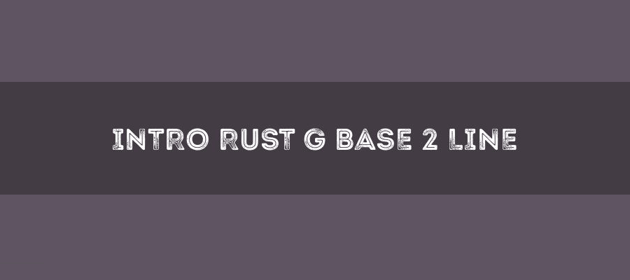
Intro Rust is a very unique font. This one is ideal for promotional material and branding because of its unique look. It has a fun feel and will make any image much more vivid. I love the look because of all the design options that are possible with this one. This font was created with web design in mind. Intro Rust comes in many different styles and weights so there is surely one that is perfect for your needs.
ChunkFive
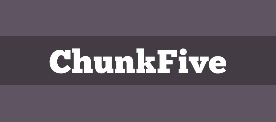
ChunkFive is a super bold slab font. It resembles newspaper headlines and offers plenty of flexibility, depending on the message you are trying to convey. This is a nice and simple, easy to read font that has a retro feel to it. Don’t be afraid to use it on your social media to give it that classical feel of reading a newspaper headline.
Exo

Exo is a very contemporary font that gives a technological and futuristic feeling, while remaining clean and stylish. It was born from a Kickstarter project and became so popular that a 2.0 version was released. This font comes in 9 different weights, making it extremely versatile. Each of its 9 sizes has a true italic version that upholds the clean and stylish feel. The font was designed by Natanael Gama.
Nexa Rust
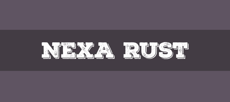
Nexa Rust is an all caps font that has a modern feel to it while also giving off a journal-like vibe. With a distressed look, it is both warm and rough. This font is often seen in images that are used to present data. It was created by the folks over at Fontfabric. The rough look can be just what you need to give your image some pop.
Museo Sans
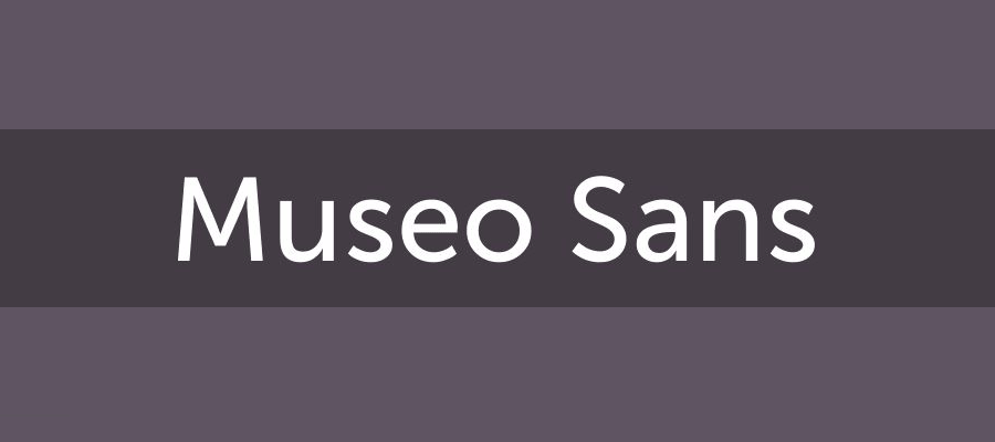
Museo Sans is a low contrast and highly-legible sans-serif style font. This font is based off of the popular Museo and was created by Jos Buivenga. It is well-suited for both display and text use. Coming in 15+ styles and weights, you will have many different options to find the perfect style to use on your social media.
Nobile
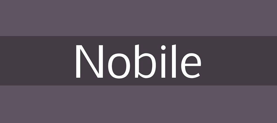
Nobile is another simplistic font that delivers all it needs to in a very elegant way. This one comes in only 2 weights and 4 styles, but that is more than enough. The font was designed by the late Vernon Adams, who has created tons of fonts that we see and use every day. Use it to give your graphics that elegant and serious feel you are trying to convey.
PT Sans

PT Sans was designed by ParaType, part of ParaGraph International, in 1989. It comes in only 4 styles, with 2 normal and 2 italic versions. However, that number is enough for most use cases. This font is pretty normal and conservative, but does offer a unique looking capital Q (with a crazy-looking tail) and many other unique characters to separate itself from the rest of the pack.
Lato

Lato is a nice-looking font from the sans-serif family. It was designed in 2010 by Łukasz Dziedzic. It’s a corporate style font that delivers a neutral tone with a clean look. Lato comes in 10 styles from thin to ultra-bold. With half rounded letters, Lato sits on the line between serious and quirky, while giving it a friendly feel. It’s versatile enough to be used in many different settings and scenarios.
Bebas Neue
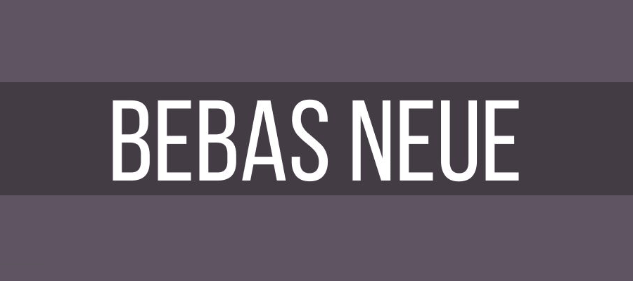
Bebas Neue is another member of the sans-serif font family, based off of the original Bebas Neue by Ryoichi Tsunekawa. This font has a simple, but warm and friendly feel to it. It comes in 5 different styles, varying in weight and size. This one has many different uses can be a great fit for your social media needs.
Getting Your Message Across
Social media graphics can be effective attention-getters. That’s why choosing the right font is so critical. Use the options above to set the perfect tone and bring more clicks to your content.