Whether it’s during a screen sharing session on Skype or someone stopping by our office, I’ll often get asked why our computer backgrounds are so “dull” to look at. No pictures of kids, cats, green pastures or big rocks. Back in my days of working as an assistant at a commercial photo studio, all of the computer desktops were gray. I never thought too much about it, but realized as I got used to it, it’s one of the first things I change after the welcome screen when setting up a new machine in our graphic design studio. Boring? Maybe. Beneficial? Definitely.
Why does it matter?
The reason is actually pretty simple: color influences color. Whether it’s that cool lava lamp you like next to your desk, or that big window in your home office that gets such nice light in the afternoon. And especially that picture of your favorite muscle car or family vacation on your computer desktop—whatever is on or around your monitor will affect what you see on screen.
If you’re serious about viewing accurately and color editing, make your desktop background gray (technically 18% gray). Macintosh has had this option built in for as long as I’ve been pointing and clicking (I know I’m dating myself here, but my first copy of Photoshop was on a floppy disk). A neutral background allows our eyes to rest and perceive color more accurately. Viewing accurate colors on computer monitors is a huge and often debated topic (we’ll tackle more on that in another article!). But, before you run out and purchase monitor calibration software, there are simple ways you can improve your viewing spaces.
Changing your desktop background to gray is also a nice way to evaluate the quality of your monitor. Ideally, you should see an even gray across the entire screen, no hot spots or unevenness. If you have more than one display, you might be shocked at how the same gray value looks different from one screen to the other. That being said, many consumer and prosumer monitors have gotten much better throughout the years. Some even come with factory calibration data. But, let’s be realistic: an inexpensive monitor simply won’t reproduce colors as well as a more expensive monitor geared toward photographers and graphic designers.
Control your lighting
If you’re in a room without windows, it’s easier to control light sources. This has gotten much easier today with a slew of quality LED bulbs that even indicate color temperature. My preference is daylight bulbs which typically have a color temperature between 5000k and 6500k. The goal is a pleasant white light that’s consistent. Ideally, we want our monitor to be the dominant viewing light. On the higher end, professional desktop viewers can be a great addition to your workspace (especially if you’re making prints), but these can be expensive. If you’re on a budget, one of my favorite options is the Ottlite Folding Task Lamp. We always have a couple floating around the studio and they’re great for comparing prints to screen.
If you’re in a room with windows, try to control them and your lighting. Room darkening shades can be helpful if you’re working in a space where the light changes throughout the day. I’m not suggesting you never look outside again, but if you’re planning on doing some color editing then it’s best to drop the shades and give your eyes a bit of time to relax and adjust.
Consider your physical workspace
What color are the walls? We spend lots of time in our workspaces and want to feel great in them, but for a serious color editing room, one can make a valid argument for subdued colors. Neutral grays are best here as well, and limit other random sources of light that may interfere with your monitor.
Consider your digital workspace
Lightroom and Photoshop users: resist the dark side. Dark interfaces that are loaded standard in these applications can seem really pleasing to the eye at first because photos appear more saturated and appear to have contrast. However, keep in mind that neutral gray in your interface will lead to better choices when color editing. Don’t be afraid of changing the preferences within applications to help them work for you instead of distracting your viewing environment.
What about blue light and all these new color settings that adapt the color of a monitor throughout the day? In an attempt to help us sleep better, most modern computers attempt to change the color of our displays: subtle shifts from more yellow in the evening and brighter, more traditional in the morning. But again, if you’re serious about color editing, and achieving color accuracy, this is a feature you’ll want to pass. By making the screen color a moving target, you’ll never get a good sense of what you’re editing and most importantly, what it will look like somewhere else.
Connecting the dots
Going gray is the first step to having a better understanding of what you are looking at onscreen and the quality of your display. It’s the first step towards embracing color management, a system in place for connecting all the (color) dots—from your monitor, printer, client and online portfolio.
Keep in mind that a gray desktop isn’t going to guarantee that the colors you’re looking at are accurate. The next step is learning how to calibrate your monitor. For that you’ll need to invest in one of several software and hardware products out there, which you’ll find many articles on across the internet.
Take away
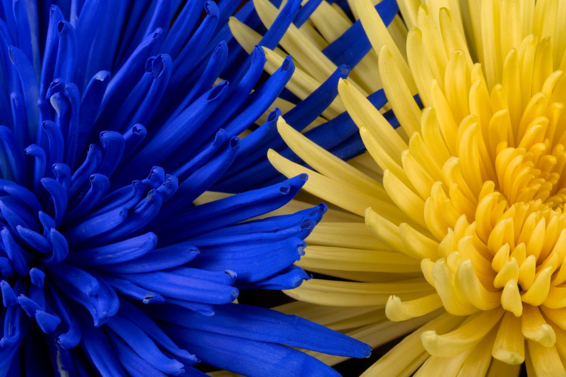
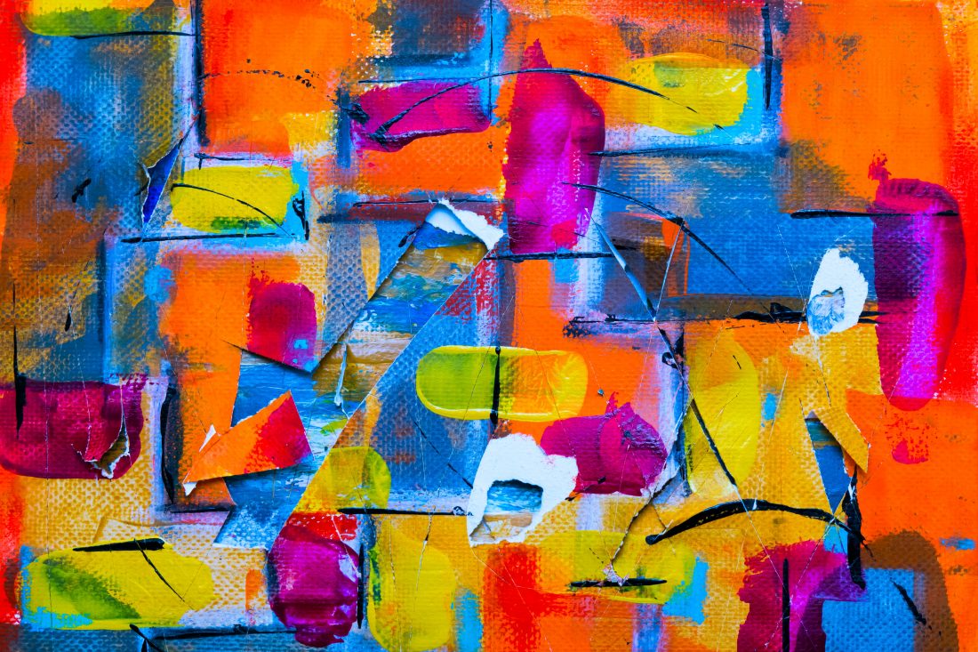
Whether you’re on the quest for color accuracy or creating a look for one of your images, locking down areas where and how you view color is a place to start. Try out these tips and check out some of these color inspired pics you can download for free: